


Focusing on innovation, we used generative AI to help users bring their imagination to life and find musical matches effortlessly
See my work


This project had a significant impact on stakeholders and leadership, as they were impressed by the solutions I proposed. My recommendations were well-received, leading to an immediate agreement to implement them in the next quarter.
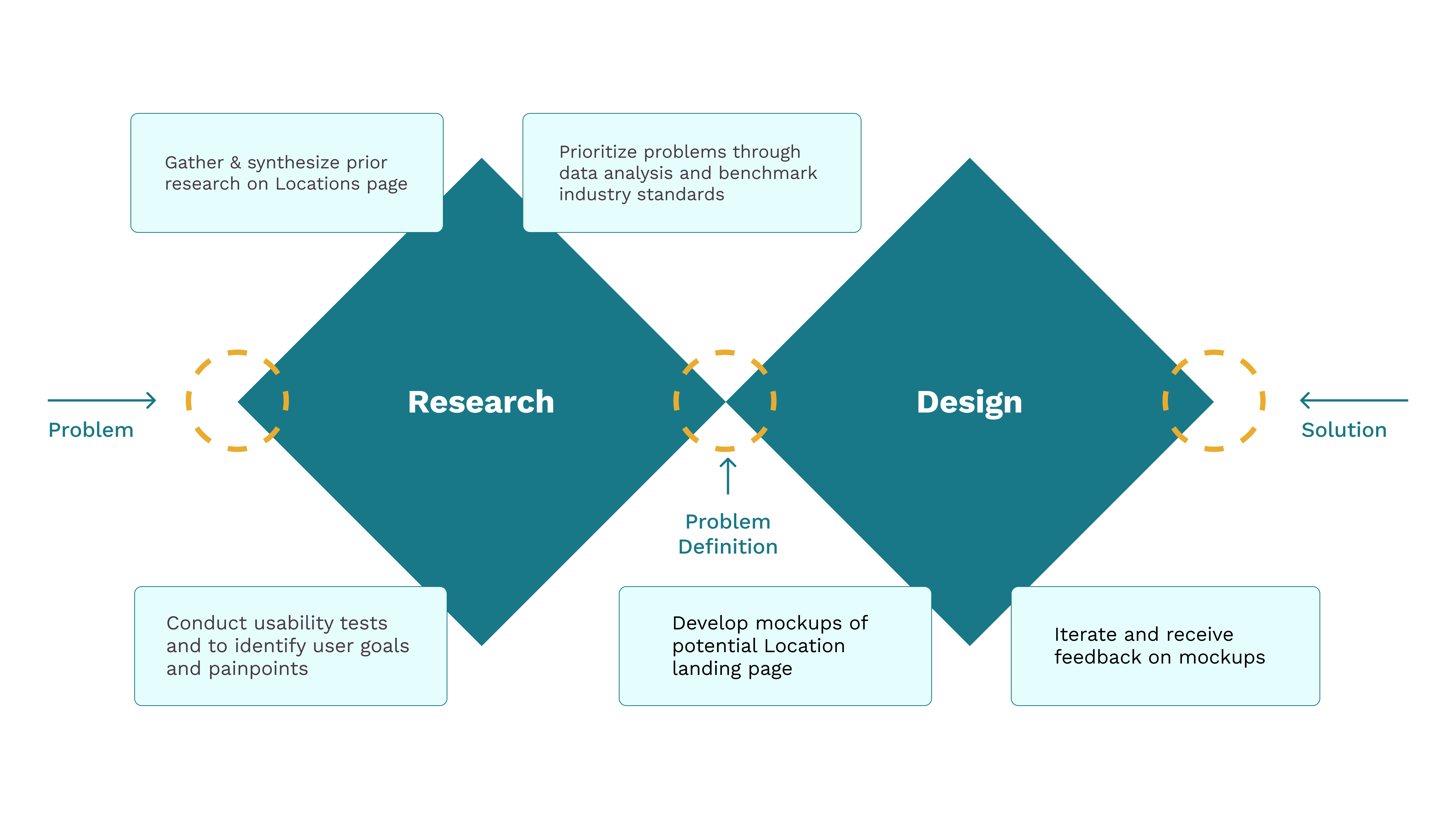
The platform is a comprehensive tool for finding doctors, care facilities, and related services.
However, the Locations landing page lacks distinction from the Find a Doctor page, failing to provide location-specific context or actionable information.
This results in a generic user experience that does not cater to users' unique needs or support seamless navigation.
Increase Digital Appointment Bookings
Drive Traffic to Local Ministry Pages
Increase User Engagement

Team
Shivani Mehta
Facilitator
Editor
Nisheta Gupta
Manager
Editor
Sandra Ye
Administrator
Editor
Hugo He
Editor
Tools Used


40% rise
in micro-influencers joining the platform within the initial three months.
25% increase
in successful brand-influencer collaborations within six months post-landing page launch.
Team
Shivani Mehta
Digital Product Design Intern
Mary Fedorowski
Director of Experience Research & Design
Devin Manternach
Digital Product Design Lead
Tools Used

Prototype Link

Limited understanding of the sales industry
Creating this app was a challenge due to my limited understanding of the intricacies of the sales industry and loan management.
Time management for interviews and testing
The users' full-time commitments at the showroom made it challenging to schedule tests and interviews without disrupting their daily operations.
Challenging age group targeting
Inquiring about people's age felt uncomfortable, and the showrooms predominantly catered to a younger demographic.
The primary goal was to bridge the gap between B2B and B2C operations, creating a seamless and transparent process while ensuring secure payments.
To achieve this, it was necessary to deep dive into the user pain points and goals and break them down into smaller, actionable objectives through user interviews.

How do you manage and track car sales leads at present?
How do you maintain communication and follow up with potential customers effectively in your experience?
How do you manage and organize customer information and data in your approach?
How valuable would it be for you to have an app that integrates smoothly with your current sales tools and systems?
Have you used any sales management apps before? If yes, what did you like or find challenging about them?
What additional features or functionalities could enhance your ability to manage car sales efficiently?
Expressed frustration
in managing loan-related tasks due to the inefficiency of juggling multiple tools and systems.
Expressed desire for learning
by gaining access to essential tools and resources in handling challenges during car sales.
Prioritized goal-setting feature
enabling them to define and track their sales targets seamlessly for improved performance in car sales.

I love helping customers find their dream cars, but the paperwork can be overwhelming. I need a solution that simplifies the administrative tasks and keeps me informed about the latest models and pricing.
Fierce Competition
Faces pressure to meet sales targets in a competitive market.
Tedious paper-work
Struggles with tedious and time-consuming paperwork.
Lack of resources
Encounters challenges in finding efficient tools and resources to support sales efforts.
Goal-setting feature
Increase car sales and commissions by setting sales targets.
Access to resources
Seek tools and resources that can make his sales process more efficient.
Serve customers
Access to detailed car information, pricing, and features to answer customer inquiries.
As a Gen Z Micro Influencer, I strive to connect with relevant brands directly, without any middlemen, and have greater control over brand collaborations. My primary goal is to increase my visibility and gain access to exclusive deals and promotions that align with my values and interests. Therefore, I am looking for a user-friendly platform that offers a seamless experience, making it easy for me to understand and navigate.
Obstacles due to middlemen and irrelevant brand collaborations
Lack of visibility and recognition as a micro influencer
Difficulty in understanding and navigating complex technology and features
Increase visibility & connect with relevant brands directly
Increase visibility & connect with relevant brands directly
Increase visibility & connect with relevant brands directly


Empowering users with the ability to select their preferred language enhances their comfort and ease of navigation within the app. It broadens the app's accessibility.
Gamification adds an element of fun and competition to apps, boosting user engagement and motivation. It encourages users to achieve goals, and interact enjoyably with the app
Color coding and labels in interface design streamline user interaction by providing visual cues and clear descriptions, improving usability and user understanding.
Onboarding screens are introductory screens that guide users through its features and functionalities, helping them become familiar with the app's interface and purpose.

.png)


1. We engaged the same 5 participants from the UX research for usability testing, ensuring alignment with our target user group.
2. The usability testing took the form of moderated sessions, in the user's showrooms at their convenience.
3. Participants were assigned 6 tasks mentioned below, and I observed and recorded their actions and behaviors while maintaining periodic communication with them throughout the process.
Onboarding process
Explore the onboarding screens and register as a new user.
Navigate to Learning resources
Check out the "Learning Resources" available in the app.
Add a new customer
Go ahead and try to add a new customer.
*Customer details were provided in the task sheet*
Check loan eligibility
After adding the customer, check if the customer is eligible for a loan.
Add a new follow-up
Add a follow-up for the new customer for their new car.
*Car details were provided in the task sheet*
Update follow-up status
Go to your follow-ups and update the status the recent follow-up to "Mark as done".

Faced language barrier
During the onboarding process, users encountered language barriers that hindered their ability to register on the app.
Found it difficult to navigate
Users couldn't find the "Learning Resources" option easily. It wasn't discoverable
Unable to save and navigate
Users were frustrated with the missing "save details" option and unclear navigation while adding a new customer, leading to process disruption.
Information & flow mismatch
Found information and flow mismatch while checking loan eligibility of a customer
Missing 'Add Follow-up' in 'Follow-up' Tab
Users experienced difficulty locating the "Add Follow-up" option within the "Follow-up" tab, leading to confusion and hindered task completion.
Unaware of swipe gestures
Didn't know about the swipe gesture to update the status of the follow-up. Feature didn't work well with the users


-min.gif)


Customer satisfaction
After conducting usability tests, the app's design led to an enhanced customer experience. Customers were able to navigate the options seamlessly, resulting in heightened satisfaction and positive interactions.
Acquired Insight into the Sales Process
During the design process, I gained valuable knowledge about the intricacies of the sales process, enabling me to create a more intuitive and effective sales-oriented application.
Focused on Accessibility
Emphasizing accessibility through design choices tailored for users aged 40-50, the app prioritized legibility and ease of use, promoting inclusivity and effortless navigation.
Beli is a mobile-first platform built to help people track, share, and discover food experiences they love.

As the product matured, new features were shipped fast, but often without alignment across teams.
I contributed as the facilitator and editor of the team - guiding discussions, aligning decisions, and ensuring our design system was clear, consistent, and cohesive across every detail.
.jpeg)

Every good product story starts with a moment of friction.
Ours began when my teammate asked, “Why do the screens of Beli look drastically different?”

With 3 different heading styles, 2 different filter styles and 2 different tabs styles, it is no wonder that a user feels overwhelmed.
That one question turned into an audit. And that audit revealed major inconsistencies that impacted usability and scalability. I led the deconstruction of the Beli's buttons, icons and colors to uncover the inconsistencies.


We realized that what seemed like gaps pointed to a deeper pattern, users were guessing, designers had no shared system, and developers were rebuilding the same solutions.
This helped us frame our opportunity for Beli.

And that’s how YummiBite was born - 100+ reusable, accessible, and consistent components and tokens, built to support everyone from designers to developers to users.

To guide every design decision, we created a set of principles inspired by Beli's mission focusing on ease of use, social engagement and scalability


Prioritize clear, minimalistic interfaces that reduce cognitive load without compromising usability.
Encourage sharing, discovery, and engagement through socially-driven components that connect users with the Beli app and community.
Create scalable and modular design solutions, allowing for collaboration, customization, and innovation.

We had way too many button styles, so I took ownership of creating a structured library, categorizing them by state, size, and intended use to bring consistency and clarity to the system.

Tabs had inconsistent styles and unclear states, so I helped the team build a robust component library with clear usage rules and defined active states.


We rebuilt our color palette to meet WCAG 2.1 AA standards, and I ensured each decision was validated using Figma plugins and color contrast grids.

We set a playground to test our design system, realizing the additional need for customizable templates and iterations.

We made sure every component played by the rules, because devs don’t need guesswork, they need clarity.
My background in computer science helped me bridge the gap between design and dev by writing implementation-friendly documentation

Once YummiBite was ready, I helped craft and present a pitch deck to share its story, highlight the problems it solved, and gain stakeholder buy-in for adoption.


And that's how YummiBite changed how teams design, build, and scale at Beli. It gave the structure they were missing, and the confidence to scale with clarity.
It was challenging to align on naming for tokens and components, as everyone interpreted things differently. As the facilitator, I guided team discussions and made sure we aligned on decision points during naming conflicts and design handoff.
.jpeg)
As important as it is to create scalable components, it’s equally crucial to structure the design system in a way that’s clear, organized, and easy for the entire team to understand and use, something we realized while documenting it.

Design Systems help teams develop a culture of collaboration, inclusivity, and consistency. It’s like everyone has the same cookbook, so there’s no guessing on how to make the perfect dish every time.

As next steps, I’d focus on improving accessibility at the component level by creating detailed checklists for designers and developers, and continuing usability testing to ensure the system works well for all users in real-world scenarios.


